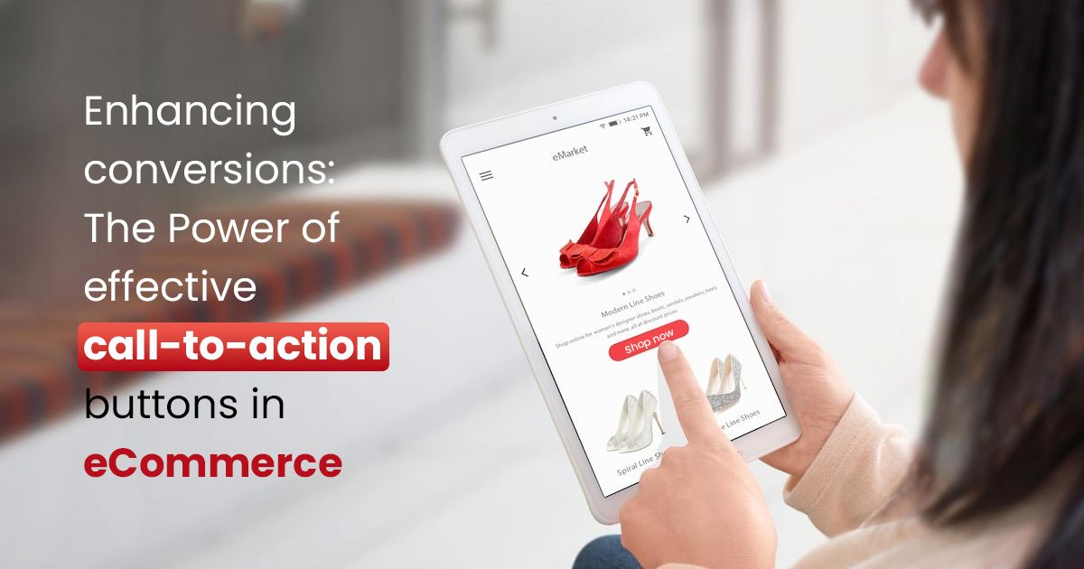
Enhancing Conversions: The Power of Effective Call-to-Action Buttons in eCommerce

Introduction:
In the fast-paced world of eCommerce, the ability to convert visitors into customers is crucial for success. One of the most influential elements in driving conversions on your website is the effective use of call-to-action (CTA) buttons. A well-designed and strategically placed CTA button can capture attention, guide users through the buying journey, and ultimately lead to increased conversions. In this article, we will explore the significance of effective CTAs and provide insights into optimizing them to enhance conversions on your eCommerce website.
1. Clear and Compelling Messaging:
An effective CTA button starts with clear and compelling messaging. The text on the button should be concise, action-oriented, and convey a sense of urgency or value. Instead of generic phrases like “Submit” or “Click Here,” use persuasive language that encourages immediate action. For example, “Shop Now,” “Get Your Discount,” or “Join the Exclusive Club.” The messaging should clearly communicate the benefit or value that users will receive by clicking the button.
2. Use of Contrasting Colors:
The colour of your CTA button plays a significant role in attracting attention and guiding users’ focus. Choose a colour that stands out from the rest of the page’s design and complements your overall brand aesthetics. Use contrasting colours to make the button visually distinct and easily recognizable. A colour that contrasts with the background and other elements on the page will draw attention and make the CTA button more prominent.
3. Placement and Visibility:
Strategic placement and visibility of your CTA buttons are crucial for capturing user attention and encouraging action. Position them prominently on the page, ensuring they are above the fold or within immediate view upon page load. The most common placements include the top right corner of the page, beneath product descriptions, or at the end of a persuasive product copy. Test different placements to find the most effective positioning for your specific website and audience.
4. Mobile-Friendly and Responsive Design:
In the mobile-dominated era, optimizing your CTAs for mobile devices is paramount. Ensure that your CTA buttons are responsive and easily clickable on different screen sizes. Make sure the text is legible, and the buttons are appropriately sized for mobile touch interactions. Test the functionality and appearance of your CTAs across various mobile devices to ensure a seamless and user-friendly experience.
5. Use of Persuasive Design Elements:
Beyond text and colour, incorporating persuasive design elements can further enhance the effectiveness of your CTA buttons. Add visual cues such as arrows, icons, or symbols that direct attention towards the button. Surround the button with white space to make it more visually appealing and distinguishable. Additionally, consider adding subtle animations or hover effects that draw attention and create a sense of interactivity.
6. Create a Sense of Urgency:
Utilizing urgency in your CTA messaging can be a powerful motivator for driving conversions. Conveying a sense of scarcity or time sensitivity compels users to take immediate action. Phrases like “Limited Time Offer,” “Only X Items Left,” or “Sale Ends Soon” can create a sense of urgency and encourage users to act swiftly to avoid missing out on a deal or opportunity.
7. A/B Testing and Optimization:
Continuously test and optimize your CTAs to identify the most effective variations. Implement A/B testing by creating multiple versions of your CTA buttons and measuring their performance. Test different colours, text variations, button sizes, and placements to find the combination that resonates best with your target audience. Monitor conversion rates, click-through rates, and engagement metrics to determine which CTAs are driving the highest conversions.
8. Use CTA Hierarchy:
If your eCommerce website has multiple CTAs on a single page, establish a clear hierarchy to guide users towards the most important actions. Determine the primary CTA that aligns with your main conversion goal, such as “Add to Cart” or “Buy Now,” and make it visually distinct and prominent. Secondary CTAs, such as “Learn More” or “Sign Up for Updates,” can be designed to have a slightly lower emphasis. This hierarchy helps users understand the intended user journey and increases the likelihood of conversions.
9. Align CTAs with Customer Journey:
Tailor your CTAs to align with different stages of the customer journey. On product pages, use CTAs that focus on adding items to the cart or initiating the purchase process. On category or landing pages, use CTAs that encourage users to explore further or browse specific collections. By understanding where users are in their journey and providing appropriate CTAs, you can guide them towards conversion more effectively.
10. Incorporate Trust Elements:
Instilling trust is crucial for eCommerce conversions. To enhance trust and credibility, consider incorporating trust elements near your CTAs. This can include security badges, payment icons, customer reviews, or trust seals. These elements provide reassurance to users and alleviate concerns they may have about making a purchase, ultimately boosting conversions.
Conclusion
Effective call-to-action buttons are essential tools for driving conversions on your eCommerce website. By focusing on clear and compelling messaging, using contrasting colours, strategic placement, mobile-friendly design, persuasive elements, creating a sense of urgency, conducting A/B testing, establishing CTA hierarchy, aligning CTAs with the customer journey, and incorporating trust elements, you can optimize your CTAs to enhance conversions and maximize the effectiveness of your eCommerce website. Paying attention to the details and continuously iterating and optimizing your CTAs will lead to improved user engagement, increased conversions, and ultimately, greater success in your eCommerce endeavours.
Ignite Your Sales Potential with a State-of-the-Art eCommerce Website.
Are you ready to leave your competitors in the dust? Our team of eCommerce website developers is here to equip your business with a powerful online presence. With our expertise in responsive design, mobile optimization, and SEO strategies, we’ll create eCommerce website solutions that not only captivate your audience but also attracts organic traffic and drives conversions. Don’t miss out on the opportunity to maximize your revenue – reach out to us today and let’s embark on a journey towards eCommerce success.
Subscribe to our Blog
Read our newly created blogs delivered straight to your inbox.


