4 Checkout Processes you need to know for an eCommerce Store

eCommerce Checkout Process
Different types of checkout processes are the result of such experiments. You can opt for a single-page or one-click or multi page checkout depending upon the needs of the eCommerce store. However, a major point of debate is selecting the ideal checkout process for an online store. Is it the single page checkout or the multi-page one? The answer to this question varies from case to case. Below we have discussed different eCommerce checkout processes along with their pros and cons. The list will help you in picking the perfect procedure for your online store.Single Page Checkout
One of the most popular and widely recognized checkout processes is the Single Page Checkout. As the name suggests, it’s a form that fits entirely on one page. The buyer gets all the elements of checkout like cart summary, payment options, address details, et cetera on one screen. Unlike accordion checkout, he/she can fill this form in any order. Single page checkout is preferred by SaaS based eCommerce platform owners because it simplifies the entire process with fewer pages and clicks. Why Have?- Reduction in Checkout Abandonment: Most of the eCommerce stores suffer revenue loss due to checkout cart abandonment. Owing to its simple structure, a single page checkout reduces the abandonment rate as the buyers have all the information on the screen. They do not have to move between pages to confirm the details, which means fewer distractions.
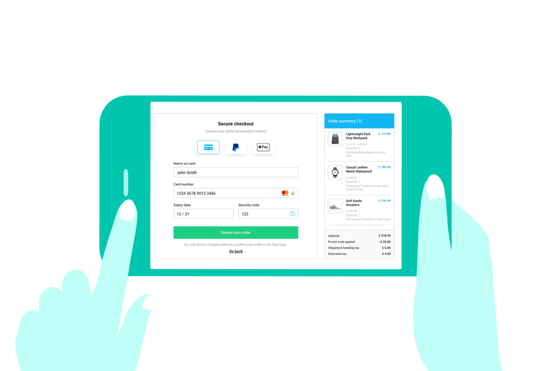
Single Page eCommerce Checkout
- Easy Process: It’s less time-consuming and easy to fill, as all the checkout elements are available on one page. Hence makes all the time-conscious buyers happy and their shopping experience more appealing.
- Easy to Review Order: In a single page checkout, the buyer doesn’t have to shuffle between pages to review the cart. And this helps in fast decision-making, which boosts sales.
- Loss of Data: The checkout process may be quick, but it places restrictions on re-marketing. If the buyer abandons the cart, then you will not receive his/her email address to run email marketing campaigns.
- Slow Page Loading: A huge disadvantage of single page checkout is the slow loading of the page. Customers prefer shopping at fast eCommerce platforms, and a high volume of data on one page increases its loading time.
- Lack of Statistics: Google Analytics will not be able to identify the reason for cart abandonment due to single page information.
Single/One Click Checkout
In this checkout process, the buyer is directly taken to the payment portal and enables purchasing in a single click. While a single page checkout asks the buyer to fill different elements, in one click checkout, all the information is pre-filled because the user already has his/her account created on the store. It is usually denoted by the Buy Now button which is adjacent to the Add to Cart button. Why Have?- Increased Sales: One click checkout is the best way to generate sales via impulsive buyers. Due to the fast checkout process, the buyers will not devote time in reviewing the order and will purchase more.
- Speed: As compared to all the checkout processes in the eCommerce market, one-click checkout is the fastest. It is a perfect choice for buyers who have no time to waste while shopping online.
- Order Review: Unlike single page and multi page checkout, here it is not possible for the customers to review their order. It may become a negative point for some customers who are familiar with the standard order review section.
Multi Page Checkout
It can be called as the backbone of SaaS based eCommerce platforms. The entire checkout process is divided into several pages like general user information, shipping address, payment details, cart summary, etc. Multi page checkout isn’t the fastest of all processes but is understood by most of the online shoppers. Why Have?- Easy to Fill: Instead of asking a lot of information from the shoppers at once, multi page checkout divides the process into steps. Due to this, the checkout process becomes easy and user-friendly for the buyers.
- Leverage Analytics: A huge benefit of this checkout process is that it enables you to identify the point where your customers exit the buying process. Using that data, you can devise strategies for retaining those leaving customers.
- Data Collection: Multi page checkout helps you collect a good amount of data like email addresses, even if the buyer abandons his/her cart. You can use this data to plan marketing campaigns and increase abandoned cart recovery.
- Good for Conscious Buyers: This checkout process provides an option for conscious shoppers to review their cart thoroughly before making the purchase. It is very beneficial for a SaaS based eCommerce platform selling luxury good.

Multi Page Checkout Process
Why Avoid?- More Time Consuming: The only, but a major disadvantage of the multi page checkout is the amount of time required in completing the process. It is negative for time-conscious consumers and often results in cart abandonment.
Accordion Checkout
In the accordion checkout, the information is collected on one page but in different sections. And each section operates in an expand-collapse manner. Only one section remains active in which the shopper is filling the requirements. As soon the information is filled the section collapses, and the succeeding section gets activated. Accordion checkout gained a boost in popularity because it enables a smooth transition from one section to another. Why Have?- No Distractions: Accordion checkout hides other sections until the preceding section is filled. And this leads to the elimination of distraction for the buyers, hence making the checkout process simple and straight-forward.
- Awesome User-Interface: The expanding and collapsible view of sections give accordion checkout a stunning user-interface. It makes the entire process of checking out smooth and appealing for the buyer.
- Problem for Mobile Users: The expanding and collapsing sections will work flawlessly on big screens. However, in the case of mobile shoppers, until the store is properly optimized, accordion checkout will cause trouble.
- Loss of Data: While filling different sections, if by mistake, the user clicks on the Back button, then all the information filled will be lost. It results in frustration and may even lead to cart abandonment by the buyer.
Over to You
So, these are various checkout processes for your SaaS based eCommerce platform. Each has its pros and cons, and selection should be made by considering the requirements of your eCommerce store. The goal should be to make the checkout process as simple and buyer friendly as possible.Subscribe to our Blog
Read our newly created blogs delivered straight to your inbox.
